In this article we are going to learn How to create Embossed Text Effect using HTML and CSS. We will use the CSS text-shadow property to get the desired output. Let’s explore how to accomplish this.
HTML Code
<!DOCTYPE html>
<html lang="en" dir="ltr">

<head>
    <meta charset="utf-8">
    <title>Embossed Text Effect</title>
</head>

<body>
    <div class="wrap">
        <h2>CSSHINT</h2>
    </div>
</body>

</html>
CSS Code
/* embed google font what ever you want to add */

@import url('https://fonts.googleapis.com/css2?family=Poppins:wght@700&display=swap');

body{
  color: #4e4e4e;
   font-family: poppins;
   margin: 0px;
  padding: 0px;
  background: rgba(0,45,128,0.8);
  font-weight: 700;
}

.wrap h2{
  font-size: 8rem;
  text-align:center;
  line-height:1;
  text-transform:uppercase;
  text-shadow: -3px 2px 5px rgba(0, 0, 0, 0.2), 3px -1px 0 rgba(255, 255, 255, 0.5);
    color: rgba(0,45,128,0.8);
}
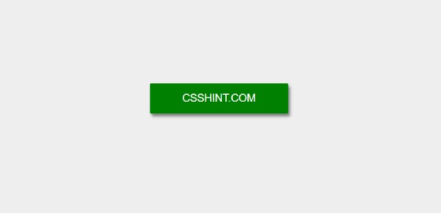
Output

Embossed Text Effect using CSS
I Hope you enjoyed this post. you can use this html css code and recreate embossed text effect in your next web design project. Thanks