In this post we are going to show you how to create Gooey Toggle Switch using css. this amazing snippet Designed by Vincent Durand.
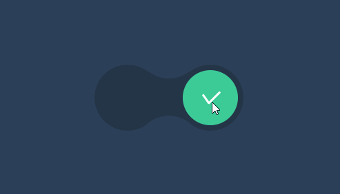
Demo : Gooey Toggle Switch using css
The Html
[code language=”html”]
<div class="form">
<input type="checkbox" id="bubble" />
<label class="bubble" for="bubble"></label>
</div>
[/code]
CSS
[code language=”css”]
body{
color: #151B25;
background-color: #2C4159;
}
.form {
position: absolute; top: 50%; left: 50%; height: 100px;
padding: 10px 0;
width: 260px;
transform: translate3d(-50%,-50%,0);
}
.form:before {
content: ”;
position: absolute;
top: 0;
left: -5px;
height: 100%;
width: 120px;
background-color: #243548;
border-radius: 50%;
box-shadow: 75px 0 0 #243548, 150px 0 0 #243548;
}
.form:after {
content: ”;
position: absolute;
top: -94px;
left: 70px;
height: 100%;
width: 120px;
background-color: #2C4159;
border-radius: 50%;
box-shadow: 0 188px 0 #2C4159;
}
.form input {
position: absolute;
left: -9999px;
}
.bubble{
position:absolute;
z-index:2;
top:50%;
left:50%;
height:100px;
width:100px;
transform:translate3d(-75%,-50%,0);
margin-left:-50px;
background:#BBBBBB;
border-radius: 50% 50% 50% 50% / 50% 50% 50% 50%;
border-right: 0px solid #BBBBBB;
border-left: 0px solid #BBBBBB;
animation: toggle-reverse 2s 1;
}
#bubble:checked + .bubble{
animation: toggle 2s 1;
transform:translate3d(75%,-50%,0);
background: #3CCC97;
}
.bubble:after {
content: ”;
position: absolute;
top: 50%;
margin-top: -15px;
margin-left: -2px;
height: 30px;
width: 4px;
background: #fff;
left: 50%;
transform: rotate(45deg);
border-radius: 2px;
transition: 500ms ease all 1.25s;
}
.bubble:before {
content: ”;
position: absolute;
top: 50%;
margin-top: -15px;
margin-left: -2px;
height: 30px;
width: 4px;
background: #fff;
left: 50%;
transform: rotate(-45deg);
border-radius: 2px;
transition: 500ms ease all 1.25s;
}
#bubble:checked + .bubble:after {
content: ”;
position: absolute;
top: 50%;
margin-top: -15px;
margin-left: 5px;
height: 30px;
width: 4px;
background: #fff;
left: 50%;
transform: rotate(225deg);
border-radius: 2px;
}
#bubble:checked + .bubble:before {
content: ”;
position: absolute;
top: 50%;
margin-top: -7px;
margin-left: -10px;
height: 20px;
width: 4px;
background: #fff;
left: 50%;
transform: rotate(-215deg);
border-radius: 2px;
}
@keyframes toggle {
0% {
transform:translate3d(-75%,-50%,0);
border-right: 0 solid #BBBBBB;
border-left: 0 solid #BBBBBB;
background:#BBBBBB;
border-radius: 50% 50% 50% 50% / 50% 50% 50% 50%;
height: 100px;
}
20% {
border-right: 0 solid #BBBBBB;
border-left: 0 solid #BBBBBB;
border-radius: 50% 50% 50% 50% / 50% 50% 50% 50%;
transform:translate3d(-75%,-50%,0);
height: 100px;
}
40% {
border-left: 0 solid #BBBBBB;
border-radius: 35% 65% 65% 35% / 50% 50% 50% 50%;
height: 90px;
}
50% {
transform:translate3d(0%,-50%,0);
border-right: 25px solid #BBBBBB;
border-left: 0 solid #BBBBBB;
background:#BBBBBB;
border-radius: 50% 50% 50% 50% / 50% 50% 50% 50%;
height: 90px;
}
75% {
border-left: 25px solid #3CCC97;
border-color:#3CCC97;
background: #3CCC97;
border-radius: 65% 35% 35% 65% / 50% 50% 50% 50%;
height: 90px;
}
100% {
border-right: 0 solid #3CCC97;
border-left: 0 solid #3CCC97;
border-radius: 50% 50% 50% 50% / 50% 50% 50% 50%;
transform:translate3d(75%,-50%,0);
height: 100px;
width:100px
}
}
@keyframes toggle-reverse {
0% {
transform:translate3d(75%,-50%,0);
background: #3CCC97;
border-right: 0 solid #3CCC97;
border-left: 0 solid #3CCC97;
border-radius: 50% 50% 50% 50% / 50% 50% 50% 50%;
height: 100px;
}
20% {
border-right: 0 solid #3CCC97;
border-left: 0 solid #3CCC97;
border-radius: 50% 50% 50% 50% / 50% 50% 50% 50%;
transform:translate3d(75%,-50%,0);
height: 100px;
}
40% {
border-right: 0 solid #3CCC97;
border-radius: 65% 35% 35% 65% / 50% 50% 50% 50%;
height: 90px;
}
50% {
transform:translate3d(0%,-50%,0);
border-left: 25px solid #3CCC97;
border-right: 0 solid #3CCC97;
background: #3CCC97;
border-radius: 50% 50% 50% 50% / 50% 50% 50% 50%;
height: 90px;
}
75% {
border-right: 25px solid #BBBBBB;
border-color:#BBBBBB;
background:#BBBBBB;
border-radius: 35% 65% 65% 35% / 50% 50% 50% 50%;
height: 90px;
}
100% {
border-right: 0 solid #BBBBBB;
border-left: 0 solid #BBBBBB;
border-radius: 50% 50% 50% 50% / 50% 50% 50% 50%;
transform:translate3d(-75%,-50%,0);
height: 100px;
width:100px
}
}
[/code]