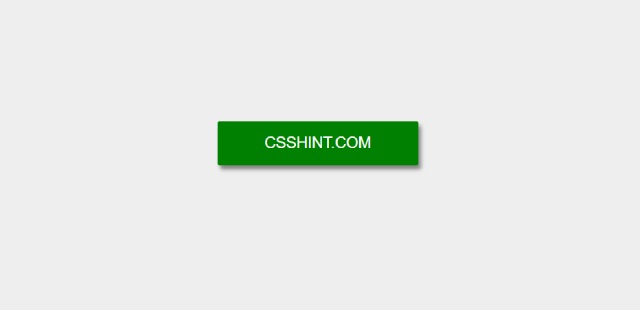
In this post we are going to learn how to create Button Tooltip On Hover using css Designed by Fabrizio Cuscini.
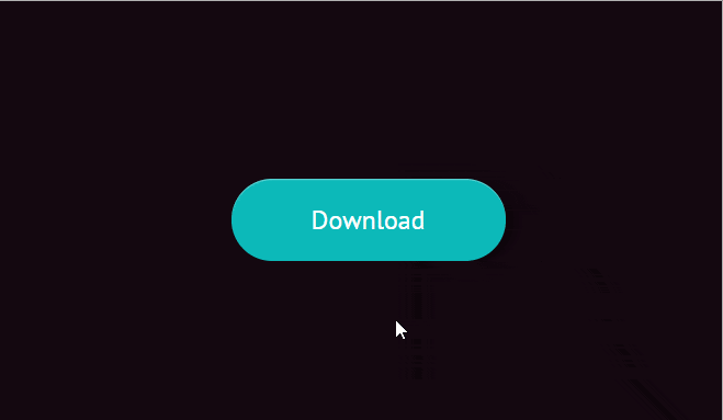
Html Button Tooltip
HTML / PUG
[code language=”html”]
a.Button(href="#0", data-tooltip="File size: 50MB")
span.Button__textWrapper
span.Button__text Download
span.Button__icon(aria-hidden="true")
[/code]
CSS / SCSS
[code language=”css”]
//- BASE
*,
*:after,
*:before { box-sizing: border-box; }
html { font-size: 16px; }
body {
display: flex;
justify-content: center;
align-items: center;
font-size: 100%;
font-family: ‘PT Sans’, sans-serif;
background-color: #150811;
height: 100vh;
}
a { text-decoration: none; }
//- COMPONENT
$duration: 500ms;
$button-height: 60px;
$button-width: 200px;
$tooltip-height: 60px;
$tooltip-width: 140px;
%Button__element {
position: absolute;
width: 100%;
height: 100%;
left: 0;
}
%Button__transitionable {
transition: top $duration;
}
.Button {
display: inline-block;
position: relative;
background-color: #0CBABA;
color: #fff;
font-size: 1.2rem;
border-radius: 1000px;
width: $button-width;
height: $button-height;
box-shadow: 0 2px 20px rgba(#000, 0.7), inset 0 1px rgba(#fff, 0.3);
text-align: center;
transition: background-color $duration, transform 100ms;
&__textWrapper {
@extend %Button__element;
overflow: hidden;
}
&__text {
@extend %Button__element;
@extend %Button__transitionable;
line-height: $button-height;
top: 0;
}
&__icon {
@extend %Button__element;
@extend %Button__transitionable;
top: 100%;
background: url(‘https://cl.ly/0X3o100h2H0g/icon-download.svg’) no-repeat center center;
}
// Tooltip
&::before {
content: attr(data-tooltip);
width: $tooltip-width;
height: $tooltip-height;
background-color: #EEB868;
font-size: 1rem;
border-radius: .25em;
line-height: $tooltip-height;
bottom: 90px;
left: calc(50% – 70px);
}
&::after {
content: ”;
width: 0;
height: 0;
border: 10px solid transparent;
border-top-color: #EEB868;
left: calc(50% – 10px);
bottom: 70px;
}
&::before,
&::after {
position: absolute;
opacity: 0;
transition: all $duration;
visibility: hidden;
}
//- button hover
&:hover {
background-color: #01BAEF;
.Button__text { top: -100%; }
.Button__icon { top: 0; }
&::before,
&::after {
opacity: 1;
visibility: visible;
}
&::after { bottom: 60px; }
&::before { bottom: 80px; }
}
&:active { transform: translate(2px, 2px); }
}
[/code]