Check out this cool Digital Clock design With Hover Animation using css and js that has a 3D effect when you hover over it. Designed by David Khourshid.
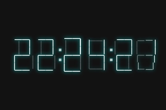
Digital Clock design
HTML
[code language=”html”]
<div class="time" id="time" data-hours="" data-minutes="">
<div class="digit">
<div class="line"></div>
<div class="line"></div>
<div class="line"></div>
<div class="line"></div>
<div class="line"></div>
<div class="line"></div>
<div class="line"></div>
</div>
<div class="digit">
<div class="line"></div>
<div class="line"></div>
<div class="line"></div>
<div class="line"></div>
<div class="line"></div>
<div class="line"></div>
<div class="line"></div>
</div>
<div class="digit">
<div class="line"></div>
<div class="line"></div>
<div class="line"></div>
<div class="line"></div>
<div class="line"></div>
<div class="line"></div>
<div class="line"></div>
</div>
<div class="digit">
<div class="line"></div>
<div class="line"></div>
<div class="line"></div>
<div class="line"></div>
<div class="line"></div>
<div class="line"></div>
<div class="line"></div>
</div>
<div class="digit">
<div class="line"></div>
<div class="line"></div>
<div class="line"></div>
<div class="line"></div>
<div class="line"></div>
<div class="line"></div>
<div class="line"></div>
</div>
<div class="digit">
<div class="line"></div>
<div class="line"></div>
<div class="line"></div>
<div class="line"></div>
<div class="line"></div>
<div class="line"></div>
<div class="line"></div>
</div>
</div>
[/code]
CSS / SCSS
[code language=”css”]
$easing: cubic-bezier(0.5, 0, 0.5, 1);
$easing-alt: cubic-bezier(0.4, 0, 0.1, 1);
$color-primary: #0BFDFD;
:root {
–mouse-x: 0;
–mouse-y: 0;
}
.time {
display: flex;
flex-direction: row;
transform: translateZ(20px);
transform:
translateZ(20px)
rotateX(calc(var(–mouse-y) * 45deg))
rotateY(calc(var(–mouse-x) * 45deg))
}
* {
transform-style: preserve-3d;
perspective: 1000px;
}
@mixin collapse($lines) {
@each $line in $lines {
:nth-child(#{$line}) {
&:before, &:after {
opacity: 0.3;
transform: translateZ(-2vmax);
}
}
}
}
.digit {
height: 20vmin;
width: 10vmin;
transform-style: preserve-3d;
perspective: 1000px;
margin: 0 1rem;
&, &:after, &:before {
transition: transform 1s $easing;
}
&:hover {
transform: translateZ(2vmax);
&:after, &:before {
transform: translateZ(-2vmax);
}
}
&:nth-child(2), &:nth-child(4) {
margin-right: 3vmax;
&:before, &:after {
content: ”;
background: white;
display: block;
position: absolute;
text-align: center;
width: 1vmax;
height: 1vmax;
left: calc(100% + 2vmax);
box-shadow: 0 0 1rem $color-primary, inset 0 0 0.25vmax $color-primary;
font-size: 8vmax;
text-shadow: 0 0 1rem $color-primary;
animation: pulse 1s alternate $easing infinite;
}
&:before {
top: 30%;
}
&:after {
bottom: 30%;
}
}
}
@keyframes pulse {
to {
opacity: 0.5;
}
}
$config: (
0: 4,
1: 1 2 4 5 6,
2: 1 7,
3: 1 5,
4: 2 5 6,
5: 3 5,
6: 3,
7: 1 4 5 6,
8: (),
9: 5,
);
@each $i, $lines in $config {
@if ($i <= 2) {
[data-hours^="#{$i}"] {
.digit:nth-child(1) {
@include collapse(map-get($config, $i));
}
}
}
[data-hours$="#{$i}"] {
.digit:nth-child(2) {
@include collapse(map-get($config, $i));
}
}
[data-minutes^="#{$i}"] {
.digit:nth-child(3) {
@include collapse(map-get($config, $i));
}
}
[data-minutes$="#{$i}"] {
.digit:nth-child(4) {
@include collapse(map-get($config, $i));
}
}
[data-seconds^="#{$i}"] {
.digit:nth-child(5) {
@include collapse(map-get($config, $i));
}
}
[data-seconds$="#{$i}"] {
.digit:nth-child(6) {
@include collapse(map-get($config, $i));
}
}
}
.line {
position: absolute;
transform-style: preserve-3d;
perspective: 1000px;
&:before, &:after {
content: ”;
display: block;
position: absolute;
color: $color-primary;
background: white;
transition: all 0.9s $easing;
border-radius: 1ch;
box-shadow:
0 0 1rem $color-primary,
inset 0 0 0.125vmin $color-primary
;
}
&:after {
transition-timing-function: $easing-alt;
}
&:nth-child(2n – 1) {
height: 50%;
width: 0.5vmin;
&:before, &:after {
height: calc(50% – 0.25vmin);
width: 100%;
}
&:before {
top: 0.25vmin;
transform-origin: center top;
}
&:after {
bottom: 0.25vmin;
transform-origin: center bottom;
}
}
&:nth-child(2n) {
width: 100%;
height: 0.5vmin;
&:before, &:after {
height: 100%;
width: calc(50% – 0.25vmin);
}
&:before {
left: 0.25vmin;
transform-origin: left center;
}
&:after {
right: 0.25vmin;
transform-origin: right center;
}
}
&:nth-child(1) {
top: 0;
left: 0;
}
&:nth-child(2) {
top: 0;
left: 0;
}
&:nth-child(3) {
top: 0;
right: 0;
}
&:nth-child(4) {
top: 50%;
left: 0;
}
&:nth-child(5) {
top: 50%;
left: 0;
}
&:nth-child(6) {
bottom: 0;
left: 0;
}
&:nth-child(7) {
top: 50%;
right: 0;
}
}
body {
display: flex;
justify-content: center;
align-items: center;
background: #121212;
transform-style: preserve-3d;
perspective: 1000px;
}
body, html {
height: 100%;
width: 100%;
margin: 0;
padding: 0;
}
*, *:before, *:after {
box-sizing: border-box;
position: relative;
}
*:before, *:after {
content: ”;
display: block;
}
[/code]
JS/ Babel
[code language=”js”]
const timeElm = document.getElementById(‘time’);
const doc = document.documentElement;
const { clientWidth, clientHeight } = doc;
const pad = (val) => val < 10 ? `0${val}` : val;
const animationFrame$ = Rx.Observable.interval(0, Rx.Scheduler.animationFrame);
const time$ = Rx.Observable
.interval(1000)
.map(() => {
const time = new Date();
return {
hours: time.getHours(),
minutes: time.getMinutes(),
seconds: time.getSeconds(),
};
})
.subscribe(({ hours, minutes, seconds}) => {
timeElm.setAttribute(‘data-hours’, pad(hours));
timeElm.setAttribute(‘data-minutes’, pad(minutes));
timeElm.setAttribute(‘data-seconds’, pad(seconds));
});
const mouse$ = Rx.Observable
.fromEvent(document, ‘mousemove’)
.map(({clientX, clientY}) => ({
x: (clientWidth / 2 – clientX) / clientWidth,
y: (clientHeight / 2 – clientY) / clientHeight,
}));
const smoothMouse$ = animationFrame$
.withLatestFrom(mouse$, (_, m) => m)
.scan(RxCSS.lerp(0.1));
RxCSS({
mouse: smoothMouse$
}, timeElm);
[/code]