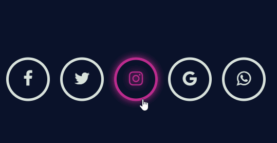
Glowing Social Icon Hover Animation : Checkout this social media icons designed with neon effect on hover designed by Rajeshdn.
Glowing Social Icon Hover Animation
HTML
[code language=”html”]
<link href="https://maxcdn.bootstrapcdn.com/font-awesome/4.7.0/css/font-awesome.min.css" rel="stylesheet" integrity="sha384-wvfXpqpZZVQGK6TAh5PVlGOfQNHSoD2xbE+QkPxCAFlNEevoEH3Sl0sibVcOQVnN" crossorigin="anonymous">
<div class="wrapper">
<ul>
<li class="facebook"><a href="#"><i class="fa fa-facebook fa-2x" aria-hidden="true"></i></a></li>
<li class="twitter"><a href="#"><i class="fa fa-twitter fa-2x" aria-hidden="true"></i></a></li>
<li class="instagram"><a href="#"><i class="fa fa-instagram fa-2x" aria-hidden="true"></i></a></li>
<li class="google"><a href="#"><i class="fa fa-google fa-2x" aria-hidden="true"></i></a></li>
<li class="whatsapp"><a href="#"><i class="fa fa-whatsapp fa-2x" aria-hidden="true"></i></a></li>
</ul>
</div>
<!– By Coding Market –>
<div class="youtube">
<a href="https://www.youtube.com/channel/UCtVM2RthR4aC6o7dzySmExA" target="_blank">by coding market</a>
</div>
[/code]
CSS
[code language=”css”]
* {
margin: 0;
padding: 0;
}
body {
background: #0A122A;
}
/* Let’s style the wrapper in such away that,
it should always be at the center of the browser */
.wrapper {
position: absolute;
top: 50%;
left: 50%;
transform: translate(-50%, -50%);
width: 550px;
}
/* Style the Un-order list by setting its list-style to none */
.wrapper ul {
list-style: none;
}
/* Style the list items inside the UL list, by setting its width, height and line-height
and float them to left and set its border and border-radius.
*/
.wrapper ul li {
width: 75px;
height: 75px;
line-height: 75px;
margin: 0 10px;
text-align: center;
cursor: pointer;
border-radius: 50%;
border: 5px solid #D8E2DC;
float: left;
transition: all 0.5s ease;
}
/* Style the icons by setting its color and margin-top value to 20px
to align it properly */
.wrapper ul li .fa {
color: #D8E2DC;
margin-top: 20px;
transition: all 0.5s ease;
}
/* Now target the specific li classes for styling and use box-shadow effect to border and text-shadow effect
to icons for glowing effect and use transition property for smooth transition effect. */
/*facebook*/
.wrapper ul li:hover.facebook {
border: 5px solid #3b5998;
box-shadow: 0 0 15px #3b5998;
transition: all 0.5s ease;
}
.wrapper ul li:hover .fa-facebook {
color: #3b5998;
text-shadow: 0 0 15px #3b5998;
transition: all 0.5s ease;
}
/*twitter*/
.wrapper ul li:hover.twitter {
border: 5px solid #00aced;
box-shadow: 0 0 15px #00aced;
transition: all 0.5s ease;
}
.wrapper ul li:hover .fa-twitter {
color: #00aced;
text-shadow: 0 0 15px #00aced;
transition: all 0.5s ease;
}
/* instagram */
.wrapper ul li:hover.instagram {
border: 5px solid #bc2a8d;
box-shadow: 0 0 15px #bc2a8d;
transition: all 0.5s ease;
}
.wrapper ul li:hover .fa-instagram {
color: #bc2a8d;
text-shadow: 0 0 15px #bc2a8d;
transition: all 0.5s ease;
}
/* google */
.wrapper ul li:hover.google {
border: 5px solid #dd4b39;
box-shadow: 0 0 15px #dd4b39;
transition: all 0.5s ease;
}
.wrapper ul li:hover .fa-google {
color: #dd4b39;
text-shadow: 0 0 15px #dd4b39;
transition: all 0.5s ease;
}
/* whatsapp */
.wrapper ul li:hover.whatsapp {
border: 5px solid #4dc247;
box-shadow: 0 0 15px #4dc247;
transition: all 0.5s ease;
}
.wrapper ul li:hover .fa-whatsapp {
color: #4dc247;
text-shadow: 0 0 15px #4dc247;
transition: all 0.5s ease;
}
/* media queries */
@media screen and (max-width: 640px){
.wrapper {
width: 350px;
}
.wrapper ul li{
margin-top: 10px;
}
.wrapper ul li.google{
margin-left: 60px;
}
}
@media screen and (max-width: 340px){
.wrapper {
width: 150px;
}
.wrapper ul li{
margin:15px;
}
.wrapper ul li.google{
margin-left: 15px;
}
}
/* youtube link */
.youtube{
position: fixed;
bottom: 10px;
right: 10px;
width: 160px;
text-align: center;
padding: 15px 10px;
background: #bb0000;
border-radius: 5px;
}
.youtube a{
text-decoration: none;
color: #fff;
text-transform: capitalize;
letter-spacing: 1px;
}
[/code]