Check out This Cool Responsive Content Block With Hover Effect for your projects. Designed by Dylan Mcleod.
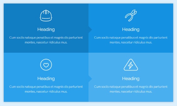
Responsive Content Block With Hover Effect
HTML
[code language=”html”]
<div id="btns">
<div class="btn" onclick="window.location=’#’">
<svg class="icon">
<use xlink:href="#helmet"></use> </svg>
<h2>Heading</h2>
<p>Cum sociis natoque penatibus et magnis dis parturient montes, nascetur ridiculus mus.</p>
</div>
<div class="btn" onclick="window.location=’#’">
<svg class="icon">
<use xlink:href="#cutters"></use> </svg>
<h2>Heading</h2>
<p>Cum sociis natoque penatibus et magnis dis parturient montes, nascetur ridiculus mus.</p>
</div>
<div class="btn" onclick="window.location=’#’">
<svg class="icon">
<use xlink:href="#heart"></use> </svg>
<h2>Heading</h2>
<p>Cum sociis natoque penatibus et magnis dis parturient montes, nascetur ridiculus mus.</p>
</div>
<div class="btn" onclick="window.location=’#’">
<svg class="icon">
<use xlink:href="#caution"></use> </svg>
<h2>Heading</h2>
<p>Cum sociis natoque penatibus et magnis dis parturient montes, nascetur ridiculus mus.</p>
</div>
</div>
[/code]
CSS / SCSS
[code language=”css”]
$primary-color: #fff;
@mixin box-sizing {box-sizing: border-box;}
@mixin transition {transition: all .3s ease-in-out;}
@mixin boxshadow {box-shadow: 0px 0px 10px 0px rgba(0,0,0,0.2);}
html {
display: flex;
justify-content: center;
align-items: center;
width: 100%;
height: 100%;
padding: 20px;
background: #ddf0fc;
@include box-sizing;
}
#btns * {
@include transition;
}
#btns {
max-width: 1200px;
margin: auto;
display: flex;
justify-content: space-around;
align-items: stretch;
flex-flow: row wrap;
@include boxshadow;
}
.btn {
position: relative;
padding: 10px 20px 25px;
width: 25%;
background: #111;
font-family: lato;
cursor: pointer;
@include box-sizing;
}
/* Button Backgrounds */
.btn:nth-child(1) {
background: #117ec3;
}
.btn:nth-child(2) {
background: #1491e1;
}
.btn:nth-child(3) {
background: #2ba1eb;
}
.btn:nth-child(4) {
background: #49afef;
}
/* Arrows */
.btn:nth-child(1):after,
.btn:nth-child(2):after,
.btn:nth-child(3):after {
position: absolute;
top: 45%;
right: -18px;
z-index: 1;
content: "";
border-top: 20px solid transparent;
border-bottom: 20px solid transparent;
border-left: 20px solid #117ec3;
@include transition;
}
.btn:nth-child(2):after {
border-left: 20px solid #1491e1;
}
.btn:nth-child(3):after {
border-left: 20px solid #2ba1eb;
}
/* Icon */
.btn .icon {
display: block;
margin: 10px auto;
width: 80px;
height: 80px;
transform-origin: center;
transform: scale(0.9);
color: $primary-color;
}
.btn .icon svg {
fill: currentColor;
}
.btn .icon path {
fill: currentColor;
}
.btn .icon {
fill: currentColor;
}
/* Text Styles */
.btn h2 {
margin-bottom: 15px;
text-align: center;
color: $primary-color;
font-family: raleway;
font-size: 1.4em;
line-height: 1em;
font-weight: 400;
}
.btn p {
color: $primary-color;
text-align: center;
font-size: 1em;
line-height: 1.5em;
font-weight: 300;
}
/* Hover Effects */
.btn:hover {
background: #0b6ca9;
}
.btn:hover:after {
border-left: 20px solid #0b6ca9;
}
.btn:hover .icon {
transform-origin: center;
transform: scale(1);
color: $primary-color;
}
.btn:hover h2 {
color: $primary-color;
}
/* Media Queries */
@media all and (max-width: 950px) and (min-width: 701px) {
.btn {
width: 50%;
}
.btn:nth-child(2):after {
border-left: 0px;
}
}
@media all and (max-width: 700px) and (min-width: 0px) {
.btn {
display: block;
width: 100%;
}
.btn:nth-child(1):after,
.btn:nth-child(2):after,
.btn:nth-child(3):after {
border-left: 0px;
}
}
[/code]