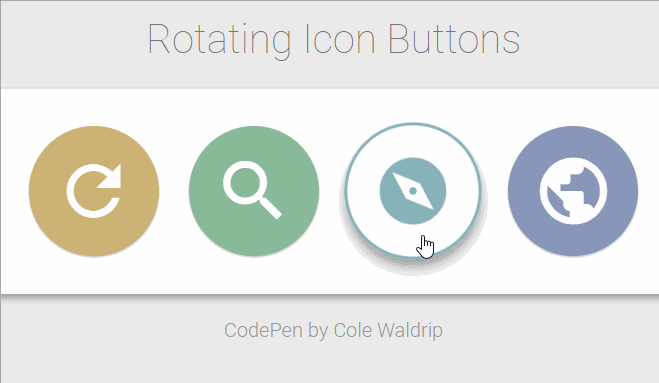
Check out this Cool rotating icons Button Effect using css Designed by Cole Waldrip.
Rotating Icon Button
HTML
[code language=”html”]
<h1>Rotating Icon Buttons</h1>
<div class="main-wrapper">
<i class="material-icons">attach_file</i>
<i class="material-icons">settings</i>
<i class="material-icons">refresh</i>
<i class="material-icons">search</i>
<i class="material-icons">explore</i>
<i class="material-icons">public</i>
<i class="material-icons">autorenew</i>
<i class="material-icons">add</i>
</div>
<p>CodePen by Cole Waldrip</p>
[/code]
CSS
[code language=”css”]
@import url(https://fonts.googleapis.com/css?family=Roboto:400,100,100italic,300,300italic,400italic,500,500italic,700,700italic,900,900italic);
* {
font-family: "Roboto", Arial, sans-serif;
}
body {
font-size: 1rem;
background-color: #ebebeb;
padding: 20px;
text-align: center;
}
h1 {
font-weight: 100;
color: #777;
}
.main-wrapper {
border-radius: 4px;
background-color: white;
padding: 20px;
box-shadow: 0 3px 6px rgba(0, 0, 0, 0.16), 0 3px 6px rgba(0, 0, 0, 0.23);
position: relative;
}
i.material-icons {
font-size: 1.5rem;
color: white;
position: relative;
border-radius: 50%;
padding: 5px;
margin: 3px;
box-shadow: 0 1px 3px rgba(0, 0, 0, 0.12), 0 1px 2px rgba(0, 0, 0, 0.24);
transition: color 0.2s ease, background-color 0.2s ease, transform 0.3s ease;
}
i.material-icons:after {
content: "";
width: 100%;
height: 100%;
border: solid 2px;
transform: scale(0.8);
position: absolute;
top: -2px;
left: -2px;
border-radius: 50%;
transition: all 0.3s ease;
}
i.material-icons:hover:after {
transform: scale(1);
box-shadow: 10px 0 20px rgba(0, 0, 0, 0.19), 6px 0 6px rgba(0, 0, 0, 0.23);
}
i.material-icons:nth-of-type(4) {
background-color: #88b999;
}
i.material-icons:nth-of-type(4):hover {
color: #88b999;
}
i.material-icons:nth-of-type(4):after {
border-color: #88b999;
}
i.material-icons:nth-of-type(5) {
background-color: #88b2b9;
}
i.material-icons:nth-of-type(5):hover {
color: #88b2b9;
}
i.material-icons:nth-of-type(5):after {
border-color: #88b2b9;
}
i.material-icons:nth-of-type(6) {
background-color: #8897b9;
}
i.material-icons:nth-of-type(6):hover {
color: #8897b9;
}
i.material-icons:nth-of-type(6):after {
border-color: #8897b9;
}
i.material-icons:nth-of-type(7) {
background-color: #af88b9;
}
i.material-icons:nth-of-type(7):hover {
color: #af88b9;
}
i.material-icons:nth-of-type(7):after {
border-color: #af88b9;
}
i.material-icons:nth-of-type(8) {
background-color: #d59acb;
}
i.material-icons:nth-of-type(8):hover {
color: #d59acb;
}
i.material-icons:nth-of-type(8):after {
border-color: #d59acb;
}
i.material-icons:nth-of-type(1) {
background-color: #cd8484;
}
i.material-icons:nth-of-type(1):hover {
color: #cd8484;
}
i.material-icons:nth-of-type(1):after {
border-color: #cd8484;
}
i.material-icons:nth-of-type(2) {
background-color: #ec9f83;
}
i.material-icons:nth-of-type(2):hover {
color: #ec9f83;
}
i.material-icons:nth-of-type(2):after {
border-color: #ec9f83;
}
i.material-icons:nth-of-type(3) {
background-color: #cdb274;
}
i.material-icons:nth-of-type(3):hover {
color: #cdb274;
}
i.material-icons:nth-of-type(3):after {
border-color: #cdb274;
}
i.material-icons:hover {
background-color: transparent;
transform: rotate(90deg);
cursor: pointer;
box-shadow: none;
}
p {
color: #999;
font-weight: 300;
margin-top: 20px;
}
@media (min-width:601px) {
i.material-icons {
padding:10px;
margin:5px;
font-size:2rem;
}
}
@media (min-width:993px) {
i.material-icons {
padding:20px;
margin:10px;
font-size:4rem;
}
i.material-icons:after {
border-width:3px;
top:-3px;
left:-3px;
}
}
[/code]